Project Information
Name of Project: Addressing Stereotypes and Diversity Project
Class: Illustration
Due Date: 9/14/2020
Date Posted: 9/12/2020
Medium: Watercolor pencil, Color pencil
Size: 9 in x 11 in
Project Description: We were tasked with revisiting one of our Scenario sketches and reworking the composition into a fully fleshed-out piece. We had to address any underlying stereotypes that may have inspired the piece, and create a composition that bolsters diversity without relying on those stereotypes. Color was required for the assignment.
Farm/Scenario Stereotype Discussion Answers
To begin the revision, we were asked to answer several questions pertaining to our past Scenario sketches. These questions required us to think consciously about any underlying bias we may have had while quickly sketching out ideas for the assignment.
Of the drawings you created, in which did you consciously address race or ethnicity? When you did address it, why and how did you address it?
I did not purposely address race or ethnicity throughout my drawings.
If you did not why not, and how might you address it if you were given another chance?
Given the time limit, I was more focused on the actions taking place over the people portrayed (after the first couple of drawings). If I was given another chance, I would take more consideration into the appearance of my characters and would research how to properly represent races and ethnicities I am not a part of.
Which drawings were the most stereotypical, and why do you think so?
The first two farmer drawings were definitely the most stereotypical, as they were two prompts that did not involve a scenario of some sort. I was able to focus more on their appearance/clothing and made characters referenced from the little knowledge I have of the practice (i.e. friends in the practice). I know this does not encompass that subgroup as a whole.
How might you make them less stereotypical if you were given another chance?
I would research more on the farming practice and the different types of people that make up that community. I would then try to experiment with clothing styles, gender, and ethnicity and try my best to portray them accurately.
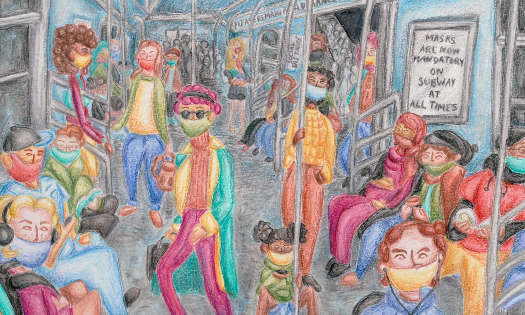
Overcrowded Subway Revisitation

I decided to revisit the “Overcrowded Subway/Bus” scenario for this project because I had several ideas for a composition that could embody many different types of people. I also wanted to address one of the main issues with public transportation currently, especially in bigger cities such as New York; the overcrowding of these methods of transportation has proved to be highly dangerous and affects everyone who uses them in some way. I wanted to make a composition that may not be overcrowded in a normal universe, but one that is difficult to social distance in.
Composition Notes

I started researching the basis of a subway, finding its dimensions, weight capacity, and seating capacity. I questioned who takes the subway, and found data that represents which kinds of people take public transportation and what for what reason. With this information, I considered who I could include in my composition.
Setting Study

I looked at various reference images to fully understand what the inside and outside of subways have in common; they are very long and can vary between narrow and medium width, they are mostly made of metal and other structural components, they include features such as rounded windows and doors, and they are covered in posters and way-finding signage.
Composition Ideas


Click to Enlarge Image
I played around with different compositions, debating whether to show the inside of a subway car or part of the subway station. I debated on how many people should be portrayed in the composition, and how I could create that claustrophobic overcrowded feel.
Hand Study

To help me practice branching out and creating more diversity in more work, I decided to do a hand study using references from the Instagram account @subwayhands. I decided to use this specific account because it is an ongoing photographic project by Hannah La Follette Ryan that emphasizes the diversity of subway-goers through their hand characteristics. This exercise was very helpful in terms of creating characters to exist within my final composition.
Composition Sketch

After several days of research, I landed on this composition. Each person I represented in the piece was greatly thought about and taken into careful consideration.
Digital Sketch Clean-Up

I took the initial sketch into Adobe Photoshop and cleaned up the line-art to have more clarity in where each element is to be placed and what is it supposed to look like. I additionally added text to a few posters to push the uneasy feel of the ongoing pandemic.
Color Palette

Before I transferred the composition back into the traditional art realm, I decided to form a color palette and figure out where different colors should be placed. The composition really came to life after this process.
Digital to Traditional Transfer

I printed out the Digital Sketch and used tracing paper to transfer the composition onto watercolor paper.
Watercolor Pencil Test

For the color process of this project, I decided to use watercolor pencils. I had never used this specific medium before, and decided to color swatch the pencil set I had. I tested how they reacted to water, and was very surprised at the vibrancy of color.
Watercolor Washes

I used watercolor pencil to create several washes of color to mostly match the color palette guide I created in Adobe Photoshop. I changed a few color choices as I did not have access to a similar color in the traditional realm with the limitations I had.
Final Piece

After the watercolor washes were laid out, I went back and added detail and shading with regular colored pencil. I darkened/dulled the colors of people that were positioned further back into the piece to create an atmospheric perspective throughout the piece. Ultimately, I am very content with the turnout of this piece and want to explore this method of medium further.
